Problem Statement
In this notebook, we will explore the relationship between height and weight using Bayesian linear regression. Our goal is to fit a linear model of the form:
$$ y = \alpha + \beta x + \varepsilon $$
where:
- $y$ represents the weight,
- $x$ represents the height,
- $\alpha$ is the intercept,
- $\beta$ is the slope,
- $\varepsilon$ is the error term, modeled as Gaussian white noise, i.e., $\varepsilon \sim \mathcal{N}(0, \sigma)$, where $\sigma$ is the standard deviation of the noise.
We will use Bayesian inference to estimate the posterior distributions of $\alpha$ and $\beta$ given our data and prior assumptions. Bayesian methods provide a natural way to quantify uncertainty in our parameter estimates and predictions.
Approach
To achieve our goal, we will:
- Load Real Data: We will use an actual dataset representing the heights and weights of individuals, sourced from Kaggle.
- Define the Bayesian Model: Using the probabilistic programming package
PyMC, we will define our Bayesian linear regression model, specifying our priors for $\alpha$, $\beta$, and $\sigma$. - Perform Inference: We will use Markov Chain Monte Carlo (MCMC) algorithms, such as the No-U-Turn Sampler (NUTS), to sample from the posterior distributions of our model parameters.
- Visualization and Prediction: We will visualize the results, including the regression lines sampled from the posterior, the uncertainty intervals, and make predictions on new, unobserved data points.
Reference
This notebook is inspired by examples from the PyMC documentation, specifically the Generalized Linear Regression tutorial. It also builds upon a similar implementation in Julia using Turing.jl. This PyMC recreation aims at providing a more complete illustration of the use of probabilistic programming languages.
Initial setup
Import the necessary packages.
Additionally, this notebook is supposed to be used in Google Colab. The data set (CSV) file is hosted in a private github repo. Therefore, include the github cloning to the temporary session so that the data can be accessed and used in the Colab session.
import os
import arviz as az
import pymc as pm
import pandas as pd
import xarray as xr
import numpy as np
import matplotlib.pyplot as plt
%matplotlib inline

plt.rcParams['text.usetex'] = True
plt.rcParams['font.family'] = 'STIXGeneral'
Bayesian Workflow
For this exercise, I will implement the following workflow:
- Collect data: this will be implemented by downloading the relevant data set
- Build a Bayesian model: this will be built using
PyMC - Infer the posterior distributions of the parameters $\alpha$ and $\beta$, as well as the model noise
- Evaluate the fit of the model
Collecting the data
The data to be analyzed will be the height vs. weight data from https://www.kaggle.com/datasets/burnoutminer/heights-and-weights-dataset
# load the data and print the header
csv_path = 'data/SOCR-HeightWeight.csv'

data = pd.read_csv(csv_path)
data.head()
| Index | Height(Inches) | Weight(Pounds) | |
|---|---|---|---|
| 0 | 1 | 65.78331 | 112.9925 |
| 1 | 2 | 71.51521 | 136.4873 |
| 2 | 3 | 69.39874 | 153.0269 |
| 3 | 4 | 68.21660 | 142.3354 |
| 4 | 5 | 67.78781 | 144.2971 |
Let’s instead work with the International System.
Convert the values to centimeters and kilograms.
# Renaming columns 2 and 3
new_column_names = {data.columns[1]: 'Height (cm)', data.columns[2]: 'Weight (kg)'}
data.rename(columns = new_column_names, inplace = True)

# convert the values to SI units
data[data.columns[1]] = data[data.columns[1]]*2.54
data[data.columns[2]] = data[data.columns[2]]*0.454


# assign the relevant data to variables for easier manipulation
height = data['Height (cm)'][:1000]
weight = data['Weight (kg)'][:1000]

data.head()
| Index | Height (cm) | Weight (kg) | |
|---|---|---|---|
| 0 | 1 | 167.089607 | 51.298595 |
| 1 | 2 | 181.648633 | 61.965234 |
| 2 | 3 | 176.272800 | 69.474213 |
| 3 | 4 | 173.270164 | 64.620272 |
| 4 | 5 | 172.181037 | 65.510883 |
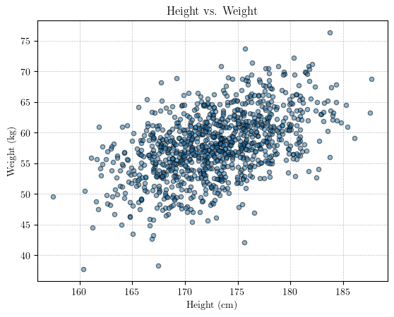
Visualize the data
# scatter plot of the data

plt.scatter(height, weight, s = 20, edgecolor = 'black', alpha = 0.5)
plt.title('Height vs. Weight')
plt.xlabel('Height (cm)')
plt.ylabel('Weight (kg)')
plt.grid(True, linestyle='--', linewidth=0.5, color='gray', alpha=0.5)
# plt.show()
Building a Bayesian model with PyMC
First, we assume that the weight is a variable dependent on the height. Thus, we can express the Bayesian model as:
$$y \sim \mathcal{N}(\alpha + \beta \mathbf{X}, \sigma^2)$$
Since we want to infer the posterior distribution of the parameters $\theta = {\alpha, \beta, \sigma }$, we need to assign priors to those variables. Remember that $\sigma$ is a measure of the uncertainty in the model.
$$ \begin{align*} \alpha &\sim \mathcal{N}(0,10) \\ \beta &\sim \mathcal{N}(0,1) \\ \sigma &\sim \mathcal{TN}(0,100; 0, \infty) \end{align*} $$ The last distribution is a truncated normal distribution bounded from 0 to $\infty$.
Note: Here, we define the input data height as a MutableData container. The reason for this is because, later, we will want to change this input data, to make predictions. This will become clear a bit later.
with pm.Model() as blr_model:

    x = pm.MutableData('height', height)

    # define the priors
    alpha = pm.Normal('alpha', 0, 10)
    beta = pm.Normal('beta', 0, 10)
    sigma = pm.TruncatedNormal('sigma', mu = 0, sigma = 100, lower = 0)

    # define the likelihood - assign the variable name "y" to the observations
    y = pm.Normal('y', mu = alpha + (beta * x), sigma = sigma, observed = weight, shape = x.shape)

    # inference - crank up the bayes!
    trace = pm.sample(1000, chains = 4)
Auto-assigning NUTS sampler...
Initializing NUTS using jitter+adapt_diag...
Multiprocess sampling (4 chains in 4 jobs)
NUTS: [alpha, beta, sigma]
Sampling 4 chains for 1_000 tune and 1_000 draw iterations (4_000 + 4_000 draws total) took 53 seconds.
We can explore the trace object.
trace.to_dataframe().columns
Index([                                  'chain',
                                          'draw',
                          ('posterior', 'alpha'),
                           ('posterior', 'beta'),
                          ('posterior', 'sigma'),
           ('sample_stats', 'perf_counter_diff'),
          ('sample_stats', 'perf_counter_start'),
             ('sample_stats', 'smallest_eigval'),
               ('sample_stats', 'step_size_bar'),
         ('sample_stats', 'index_in_trajectory'),
                      ('sample_stats', 'energy'),
            ('sample_stats', 'max_energy_error'),
                ('sample_stats', 'energy_error'),
             ('sample_stats', 'acceptance_rate'),
                  ('sample_stats', 'tree_depth'),
           ('sample_stats', 'process_time_diff'),
                   ('sample_stats', 'step_size'),
                     ('sample_stats', 'n_steps'),
              ('sample_stats', 'largest_eigval'),
                   ('sample_stats', 'diverging'),
                          ('sample_stats', 'lp'),
       ('sample_stats', 'reached_max_treedepth')],
      dtype='object')
Visualize the inference diagnostics
Now that we have performed Bayesian inference using the NUTS() algorithm, we can visualize the results. Additionally, call for a summary of the statistics of the inferred posterior distributions of $\theta$.
# visualize the results
# az.style.use('arviz-darkgrid')

labeller = az.labels.MapLabeller(var_name_map = {'alpha': r'$\alpha$',
                                                'beta': r'$\beta$',
                                                'sigma': r'$\sigma$'})

az.plot_trace(trace, var_names = ['alpha', 'beta', 'sigma'], labeller = labeller, compact = False)
plt.tight_layout()
# plt.show()
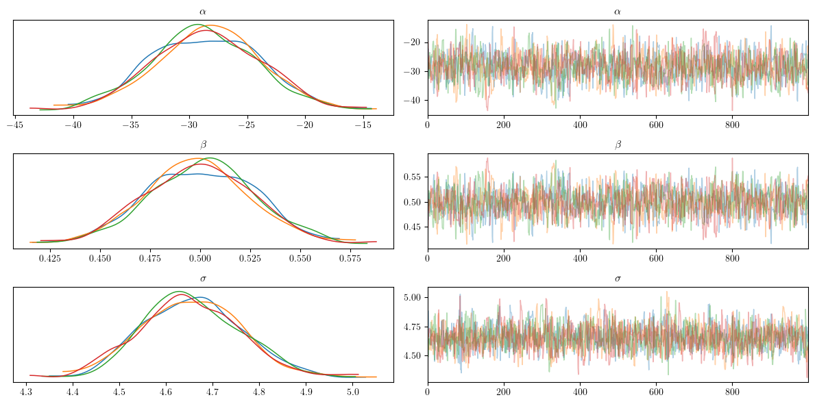
Interpreting the MCMC Diagnostics Plots
Trace plots are crucial for diagnosing the performance of Markov Chain Monte Carlo (MCMC) algorithms. These plots typically consist of two parts for each parameter: the trace plot and the posterior density plot.
The trace plot shows the sampled values of a parameter across iterations. A well-behaved trace plot should look like a “hairy caterpillar,” indicating good mixing. This means the trace should move around the parameter space without getting stuck and should not display any apparent patterns or trends. If the trace shows a clear trend or drift, it suggests that the chain has not yet converged. For the parameters $\alpha$ (intercept), $\beta$ (slope), and $\sigma$ (standard deviation of noise), we want to see the traces for different chains mixing well and stabilizing around a constant mean.
The posterior density plot shows the distribution of the sampled values of a parameter. This plot helps visualize the posterior distribution of the parameter. A good density plot should be smooth and unimodal, indicating that the parameter has a well-defined posterior distribution. If multiple chains are used, their density plots should overlap significantly, suggesting that all chains are sampling from the same distribution. For $\alpha$, $\beta$, and $\sigma$, overlapping density plots indicate that the chains have converged to the same posterior distribution.
Next, we can visualize the posterior distributions of the inferred parameters.eters.
# visualize the posterior distributions
az.plot_posterior(trace, var_names = ['alpha', 'beta', 'sigma'], labeller = labeller)
plt.show()

After visualizing the inference diagnostics and the posterior distributions of the paramters, we can also obtain the summary statistics.
# get the summary statistics of the posterior distributions
pm.summary(trace, kind = "stats")
| mean | sd | hdi_3% | hdi_97% | |
|---|---|---|---|---|
| alpha | -28.557 | 4.558 | -36.650 | -19.619 |
| beta | 0.500 | 0.026 | 0.449 | 0.548 |
| sigma | 4.657 | 0.100 | 4.474 | 4.850 |
Visualize the results
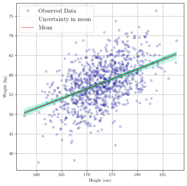
Now that we have posterior distributions for the parameters $\theta$, we can plot the the resulting linear regression functions. The following is an excerpt from PyMC’s Generalized Linear Regression tutorial:
In GLMs, we do not only have one best fitting regression line, but many. A posterior predictive plot takes multiple samples from the posterior (intercepts and slopes) and plots a regression line for each of them. We can manually generate these regression lines using the posterior samples directly.
Below, what we will effectively be doing is:
$$ y_i = \alpha_i + \beta_i \mathbf{X} \ \ \ , \ \ \ {i = 1, \ldots , N_{samples}}$$
where $N_{samples}$ are the number of samples from the posterior. This number comes from the inference procedure, and in practical terms is the umber of samples we asked PyMC to produce.
In other words, plotting the samples from the posterior distribution involves plotting the regression lines sampled from the posterior. Each sample represents a possible realization of the regression line based on the sampled values of the parameters $\alpha$ (intercept) and $\beta$ (slope).
These sample regression lines ullustrate the uncertainty in the regression model’s parameters and how this uncertainty propagates into the predictions (of the regression line).
# use the posterior to create regression line samples
# equivalent to: y[i]  = alpha[i] + beta[i]*X
trace.posterior["y_posterior"] = trace.posterior["alpha"] + trace.posterior["beta"]*xr.DataArray(height)

# plot the regression lines
_, ax = plt.subplots(figsize=(7,7))
az.plot_lm(idata = trace, y = weight, x = height, axes=ax, y_model="y_posterior",
           y_kwargs={"color":"b", "alpha":0.2, "markeredgecolor":"k", "label":"Observed Data", "markersize":10},
           y_model_plot_kwargs={"alpha": 0.2, "zorder": 10, "color":"#00cc99"},
           y_model_mean_kwargs={"color":"red"}
          )

plt.show()
Using the Linear Regression Model to Make Predictions
Now that we have a fitted Bayesian linear regression model, we can use it to make predictions. This involves sampling from the posterior predictive distribution, which allows us to generate predictions for new data points while incorporating the uncertainty from the posterior distribution of the parameters.
Sample from the Posterior Predictive Distribution:
- This step involves using the inferred
tracefrom our Bayesian linear regression modelblr_modelto generate predictions. Thepm.sample_posterior_predictivefunction in PyMC allows us to do this. It uses the posterior samples of the parameters to compute the predicted values of the outcome variable.
# now predict the outcomes using the inferred trace
with blr_model:
    # use the updated values and predict outcomes and probabilities:
    pm.sample_posterior_predictive(
        trace,
        var_names = ['y'],
        return_inferencedata=True,
        extend_inferencedata=True,
    )
Sampling: [y]
Exploring the Trace Object
The trace object stores the results of our inference. Initially, it contained the posterior samples of the model parameters (e.g., intercept and slope).
After running pm.sample_posterior_predictive, the trace object is extended to include the posterior predictive samples. These are the predicted values for the outcome variable, given the posterior distribution of the model parameters.
# explore the trace object again
trace.to_dataframe().columns
Index([                                  'chain',
                                          'draw',
                          ('posterior', 'alpha'),
                           ('posterior', 'beta'),
                          ('posterior', 'sigma'),
              ('posterior', 'y_posterior[0]', 0),
          ('posterior', 'y_posterior[100]', 100),
          ('posterior', 'y_posterior[101]', 101),
          ('posterior', 'y_posterior[102]', 102),
          ('posterior', 'y_posterior[103]', 103),
       ...
                ('sample_stats', 'energy_error'),
             ('sample_stats', 'acceptance_rate'),
                  ('sample_stats', 'tree_depth'),
           ('sample_stats', 'process_time_diff'),
                   ('sample_stats', 'step_size'),
                     ('sample_stats', 'n_steps'),
              ('sample_stats', 'largest_eigval'),
                   ('sample_stats', 'diverging'),
                          ('sample_stats', 'lp'),
       ('sample_stats', 'reached_max_treedepth')],
      dtype='object', length=2022)
We can observe how now we have another inference data container: posterior_predictive. This was generated by passing the extend_inferencedata argument to the pm.sample_posterior_predictive function above.
This data contains predictions by passing the observed heights through our linear model and making predictions. Note that these “predictions” are made on observed data. This is similar to using validating the predictions on training data in machine learning, i.e. comparing the model predictions to the actual data on an observed input.
We can use the linear regression model to make predictions. It should be noted that, again, the linear regression model is not a single regression line, but rather a set of regression lines generated from the posterior probability of $\theta$.
Visualize the Prediction Confidence Interval
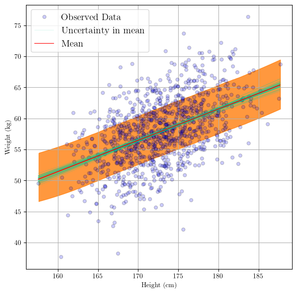
After we sampled from the posterior, we might want to visualize this to understand the posterior predictive distribution.
In the code below, there are two things going on, let’s go through them.
- Plotting the samples from the posterior distribution
This part is exactly what we did before, which is plotting the sample posteriors of the regression line. These sample regression lines are a natural product of propagating the uncertainty from the parameters unto the prediction line.
- Plotting the uncertainty in the mean and the observations
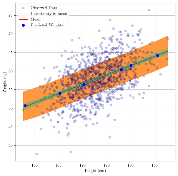
Now we can add a ribbon to show the uncertainty not only in the regression line, but in the prediction points themselves. That is, that ribbon will tell us where we might expect a prediction point $i+1$, i.e.
$$ y_{i+1} = \alpha_{i+1} + \beta_{i+1} x^* $$
where $x^*$ is a test input point. In other words, and more specific to this demonstration:
what is the interval where we would expect a predicted weight $y_{i+1}$ of an individual with a height $x*$.
# use the posterior to create regression line samples
# trace.posterior["y_posterior"] = trace.posterior["alpha"] + trace.posterior["beta"]*xr.DataArray(height)  # y_posterior = alpha + beta*x
_, ax = plt.subplots(figsize=(7,7))
az.plot_lm(idata = trace, y = weight, x = height, axes=ax, y_model="y_posterior",
           y_kwargs={"color":"b", "alpha":0.2, "markeredgecolor":"k", "label":"Observed Data", "markersize":10},
           y_model_plot_kwargs={"alpha": 0.2, "zorder": 10, "color":"#00cc99"},
           y_model_mean_kwargs={"color":"red"}
          );

# plot the prediction interval
az.plot_hdi(
    height,
    trace.posterior_predictive["y"],
    hdi_prob=0.6,
    fill_kwargs={"alpha": 0.8},
)

plt.show()
Making Predictions on Unobserved Data Inputs
Now, how about the case when we want to make predictions on test data that we have not seen? That is, predict the weight of an individual whose height/weight we have not observed (measured)
In other words, we have some test input data, i.e. some heights for which we want to predict the weights.
Some references of where I learned how to do this:
In this example and this other example it says that we can generate out-of-sample predictions by using
pm.sample_posterior_predictiveand it shows an example of how to use the syntax.More recently, this demo blog post clarifies how to make predictions on out-of-model samples.
Let’s do just that now. First, we will define the test inputs we want to predict for, pred_height. Then, inside the model, we replace the data (which was defined as MutableData, with the new data we want to make predictions on. This is done as follows:
# set new data inputs:
pred_height = np.array([ 'new_data' ])

with blr_model:
  pm.set_data({'height': pred_height})
What this is effectively doing is telling sample_posterior_predictive that we need to make predictions on height which now happens to be different.
# define the out-of-sample predictors
pred_height = [158.0, 185.5, 165.2, 178.0,  180.0, 170.2]

print(pred_height)

with blr_model:
    # set the new data we want to make predictions for
    pm.set_data({'height': pred_height})

    post_pred = pm.sample_posterior_predictive(
        trace,
        predictions = True
    )
Sampling: [y]


[158.0, 185.5, 165.2, 178.0, 180.0, 170.2]
What we have done above is create an inference data object called post_pred. This object contains the samples of the predictions on the new data. Specifically, it includes two containers: predictions and predictions_constant_data.
The predictions container holds the predicted samples for our new heights. The predictions_constant_data holds the new heights we passed into the model.
post_pred.to_dataframe()
| chain | draw | (y[0], 0) | (y[1], 1) | (y[2], 2) | (y[3], 3) | (y[4], 4) | (y[5], 5) | |
|---|---|---|---|---|---|---|---|---|
| 0 | 0 | 0 | 48.981930 | 62.971186 | 62.143385 | 59.300742 | 56.100237 | 54.329348 |
| 1 | 0 | 1 | 55.481192 | 65.132876 | 54.761877 | 61.312254 | 59.220124 | 51.817360 |
| 2 | 0 | 2 | 49.471550 | 66.016910 | 60.646273 | 57.876344 | 56.203720 | 60.318281 |
| 3 | 0 | 3 | 53.373737 | 66.593653 | 53.085799 | 63.437949 | 64.336626 | 45.372830 |
| 4 | 0 | 4 | 52.981309 | 69.320059 | 51.590686 | 60.372046 | 62.210738 | 48.188656 |
| ... | ... | ... | ... | ... | ... | ... | ... | ... |
| 3995 | 3 | 995 | 52.303814 | 61.931117 | 47.544216 | 60.824401 | 61.469545 | 62.353284 |
| 3996 | 3 | 996 | 56.032295 | 56.979040 | 54.584837 | 55.894216 | 65.943908 | 50.929285 |
| 3997 | 3 | 997 | 56.062352 | 50.889499 | 51.441003 | 57.841533 | 62.898654 | 52.749139 |
| 3998 | 3 | 998 | 48.228772 | 65.983383 | 52.381164 | 55.283946 | 65.468049 | 70.367514 |
| 3999 | 3 | 999 | 58.434184 | 54.739363 | 56.773260 | 53.128112 | 61.695469 | 54.874142 |
4000 rows × 8 columns
We can visualize the posterior distributions of the predictions.
az.plot_posterior(post_pred, group="predictions");
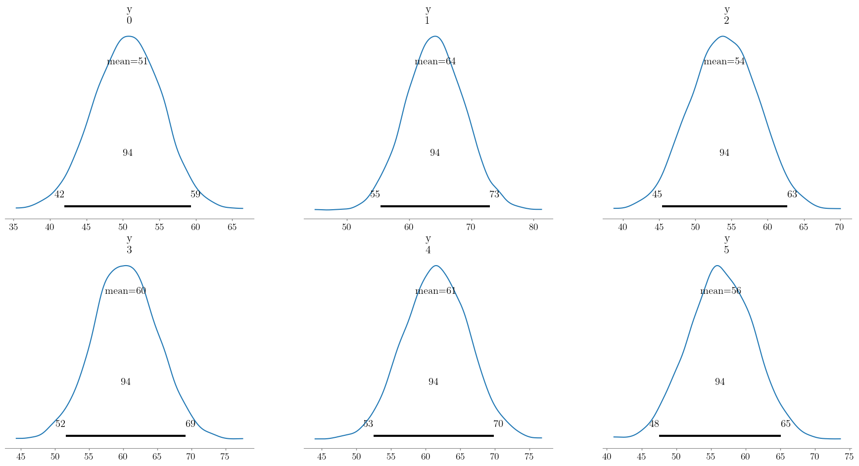
We can obtain point estimates by taking the mean of each prediction distribution. This is done by taking the mean of the predictions over the chain and draw dimensions, as follows:
pred_weight = post_pred.predictions['y'].mean(dim = ['chain', 'draw'])
print("Predicted weights: ", pred_weight.values)
Predicted weights: [50.37415152 64.29241929 54.02070975 60.60276731 61.36759368 56.53983895]
Finally, we can visualize where the predictions fall by adding a scatter plot with the new ${x^, y^}$ data.
# use the posterior to create regression line samples
# trace.posterior["y_posterior"] = trace.posterior["alpha"] + trace.posterior["beta"]*xr.DataArray(height)  # y_posterior = alpha + beta*x
_, ax = plt.subplots(figsize=(7,7))

az.plot_lm(idata = trace, y = weight, x = height, axes=ax, y_model="y_posterior",
           y_kwargs={"color":"b", "alpha":0.2, "markeredgecolor":"k", "label":"Observed Data", "markersize":10},
           y_model_plot_kwargs={"alpha": 0.2, "zorder": 10, "color":"#00cc99"},
           y_model_mean_kwargs={"color":"red"}
          );

# plot the prediction interval
az.plot_hdi(
    height,
    trace.posterior_predictive["y"],
    hdi_prob=0.6,
    fill_kwargs={"alpha": 0.8},
)

# add predicted weights to the plot

ax.scatter(pred_height,
           pred_weight.values,
           color = 'blue',
           label = 'Predicted Weights',
           zorder = 15
           )

ax.legend()

plt.show()
Thank you!
This demo focused on a relatively simple task. Here, however, we focused more on what a Bayesian approach means in the context of a linear regression. Additionally, we focused on using PyMC for developing the model, visualizing the results and, just as importantly, on making predictions using those results.
Victor